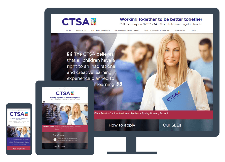
Mobile-Friendly Website Design - Responsive to Schools Partnership

Problem:
Create2Convert was approached to develop a mobile-friendly website and update the logo for the Chelmsford Schools Partnership in Essex. The challenge was to create a responsive and user-friendly website that effectively communicated the brand message, engaged visitors and enhanced the school partnership’s online presence.
Solution:
We collaborated closely with the Chelmsford Schools Partnership to deliver a comprehensive web design solution:
Mobile-Friendly Website Design:
- Visually Appealing and Intuitive Design: We created a visually appealing and intuitive website that showcased the client’s services and provided a seamless browsing experience across all devices.
- User-Centric Approach: We prioritised ease of navigation and accessibility, selecting a clean, modern layout and incorporating a responsive design that ensured optimal viewing experience on mobile devices.
- Optimised for Search Engines: We optimised the website for search engines to improve visibility and drive organic traffic, enhancing the partnership’s online presence.
Logo Update:
- Modernised Logo: We updated the logo to reflect the partnership’s identity and values, ensuring it resonated with the target audience and aligned with the new website design.
Results:
Our collaborative effort resulted in significant outcomes for the Chelmsford Schools Partnership:
- Enhanced Online Presence:
- The mobile-friendly website improved user engagement and accessibility across devices, enhancing the partnership’s online visibility.
- The modernised logo design strengthened brand identity and recognition among stakeholders.
- Improved User Experience:
- Clear calls-to-action, engaging visuals, and user-friendly application and contact forms improved the overall user experience on the website.
- Optimisation for mobile devices increased user satisfaction and interaction with the partnership’s services.
Key Achievements:
This project highlights Create2Convert’s expertise in delivering tailored web design solutions that meet the unique needs of educational partnerships. By creating a responsive and visually appealing website and updating the logo, we helped the Chelmsford Schools Partnership establish a robust online presence that stands out in its market.
Contact us today to discuss how we can help you achieve your goals with a stunning and effective web design solution. Call 01376 51 66 86, message us, or book a meeting online!


