Your website structure should follow how customers think, not how your business is organised
Your business might have departments, divisions, service lines and internal terminology that make perfect sense to you.
Your customers don’t care.
They arrive at your website trying to answer something much simpler:
‘Am I in the right place, can you help me, and where do I go next?‘
If your website makes them understand how your business is organised before they can find what they need, you’re making them work too hard.
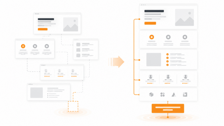
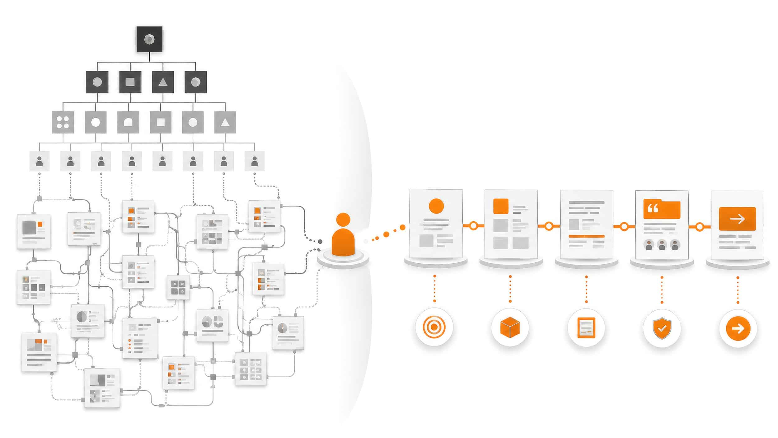
Your organisation chart shouldn’t become your website navigation
It’s surprisingly easy to structure a website from the inside out.
You know how the business works. You know what each department does. You understand the difference between your services, divisions and internal terminology.
So naturally, that structure starts appearing on the website.
The problem is that your customer doesn’t have that knowledge.
They shouldn’t need it either.
A visitor isn’t trying to understand your organisation. They’re trying to solve a problem, find a product or service, establish whether you’re credible and decide what to do next.
Your website structure needs to support their journey, not your internal one.
Start with why somebody has arrived
Different people may arrive at the same website looking for completely different things.
One person might already know exactly which service they need.
Another only knows the problem they’re trying to solve.
Someone else may be comparing you with three competitors and looking for evidence that you can actually deliver.
Good website structure accounts for those different starting points.
It gives people sensible routes into the information they need without expecting everyone to follow exactly the same journey.
Don’t make people translate your language
Internal terminology is another common problem.
A service name might make perfect sense inside your business but mean absolutely nothing to a prospective customer.
The same applies to acronyms, department names and clever labels created during internal meetings.
If someone has to click a navigation item just to find out what it means, the label isn’t doing its job.
Clarity beats cleverness here.
Navigation should help someone predict what they’re going to find before they click.
Page hierarchy matters too
Website structure isn’t just the main navigation.
The structure of individual pages matters just as much.
Someone landing on a service page shouldn’t have to read every word from top to bottom before they understand whether it’s relevant.
A strong page should help them quickly establish:
what this is
whether it’s for them
what problem it solves
why they should believe you
what they should do next
That doesn’t mean reducing every page to five bullet points.
It means putting information in an order that supports the decision someone is trying to make.
Proof needs to appear where doubt appears
Businesses often put all their testimonials on one page, all their case studies somewhere else and accreditations in the footer.
Technically, the proof exists.
But that doesn’t mean people will find it when they need it.
- If you’re making an important claim about a service, relevant proof should be close enough to support that claim.
- If somebody is considering whether you have experience in their sector, show them.
- If they’re worried about capability, demonstrate it.
- If they’re deciding whether to trust you, don’t make them hunt through the website looking for reasons.
Good website structure isn’t simply about finding pages.
It’s about putting the right information in the right place at the right point in someone’s decision.
Structure should make the next step obvious
Every page doesn’t need a huge CONTACT US NOW button.
But people should understand what they can do next.
That might be:
view a relevant project
explore a service
read supporting information
request a quote
book a conversation
The right next step depends on where they are in their decision.
What’s important is that the website doesn’t simply reach the bottom of a page and leave them there.
Butek Tanks is a good example
When developing the Butek Tanks website, the challenge wasn’t simply making an industrial website look better.
The structure had to work for the people actually using it.
Different visitors may arrive looking for a particular tank, investigating a sector application, checking technical capability or deciding whether Butek Tanks is credible enough to include in a procurement process.
That means the website needs clear routes through products, sectors, projects, technical information and proof, with an obvious route towards requesting a quote.
The structure reflects what customers need to establish rather than simply mirroring how the company operates internally.
See the Butek Tanks case study →
A clearer structure can make an existing website feel completely different
Not every structural problem means you need a new website.
Sometimes the content already exists. It’s simply organised badly.
Changing navigation, restructuring pages, improving hierarchy and connecting related information can make an existing website considerably easier to understand and use.
Other times, the existing website has been added to and altered so many times that fixing the structure properly means rebuilding it.
The important thing is to establish what’s actually wrong before deciding what to replace.
Is your website organised around your business or your customer?
Try looking at your website without thinking about how your company works internally.
- Can somebody quickly recognise where they need to go?
- Do the labels make sense without insider knowledge?
- Does each page answer the questions someone is likely to have at that point?
- Can they find relevant proof?
And when they’re ready to move forward, is the next step obvious?
If not, the problem may not be that you need more content.
The content you already have may simply be in the wrong places.
If your website needs a stronger structure
Our Strategic Website Design work starts with understanding what the website needs to achieve, what customers need from it and how the information should be structured before we start designing pages.
If you're not sure whether the problem requires a rebuild, the Website & Conversion Review can identify where the current journey is breaking down and what should be fixed first.