Your website tells people what you do. It may not tell them what they need to know.
Your website probably tells people what you do.
It lists your services.
It explains your process.
It may include an About page, previous work and several ways to get in touch.
So far, so respectable.
But when website visitors leave without enquiring, it is often because the site has described what you provide without answering what they actually need to know.
Because people are not visiting your website for a guided tour of your organisation.
They are trying to decide whether to choose you.
And those are two very different things.
People are not looking for a list of services
A potential customer may want to understand what you offer.
But that is only the first question.
They are also trying to work out:
- Is this relevant to my situation?
- Do these people understand the problem?
- Have they solved this kind of problem before?
- What makes them different?
- Can I trust them?
- What happens if I get in touch?
These are the questions that sit behind most website visits.
Yet many websites never really answer them.
They describe services from the organisation’s point of view. They explain what is delivered, how long they have been established and perhaps how committed everyone is to providing excellent service.
There is nothing wrong with any of that.
But it can still leave the visitor doing too much of the thinking.
Information does not automatically create confidence
A website can contain plenty of information and still fail to move someone towards an enquiry.
That is because information and reassurance are not the same thing.
A service description may explain what is available.
It does not necessarily explain:
- why the service matters
- whether it is right for this particular customer
- what problem it solves
- what makes your approach different
- what evidence supports your claims
- what the next step involves
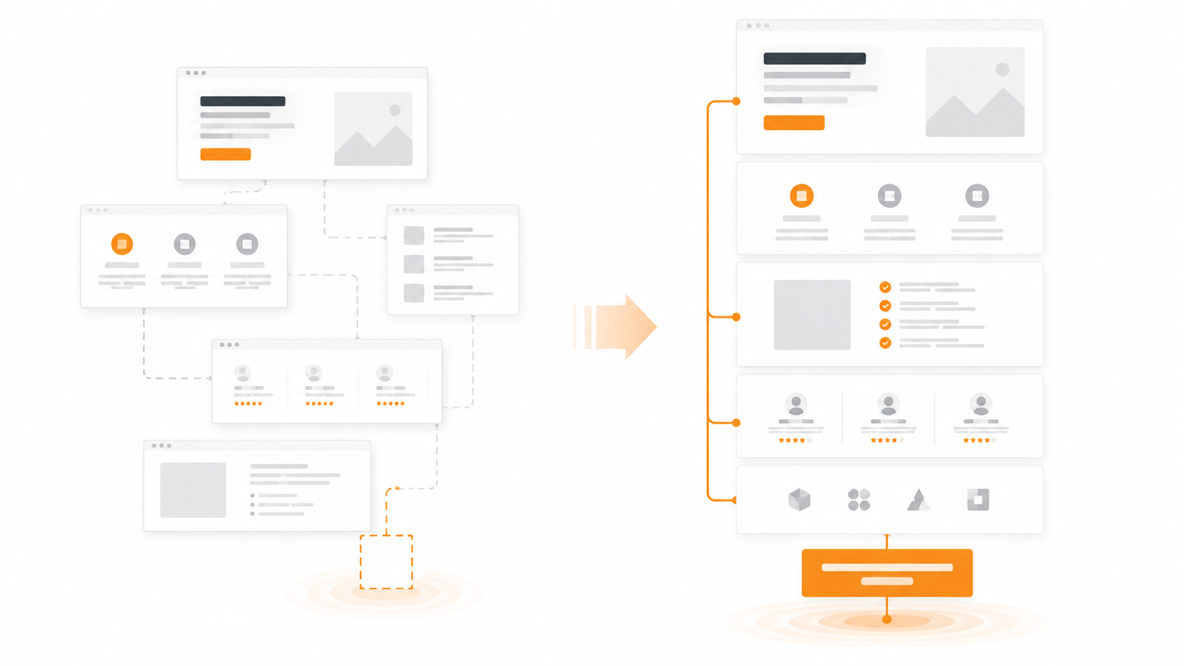
That is the difference between content that fills a page and messaging that helps someone make a decision.
One describes what you provide.
The other removes reasons to hesitate.
The most important answers often feel obvious to you
Usually, the problem is not that you have nothing useful to say.
It is that the people closest to what you do already know the answers.
You know why customers choose you.
You understand how the service works.
You know which problems appear repeatedly.
You have seen the difference your work makes.
The visitor has not.
They only know what the website puts in front of them.
And when you are close to what you do, it is easy to assume that other people will make connections that feel obvious to you.
They usually will not.
If the important points are vague, buried or spread across several pages, most visitors will not patiently piece the argument together.
They will compare you with someone who makes the decision easier.
The answers may exist, but appear too late
Sometimes the website does contain the right information.
It is simply in the wrong place.
The proof is hidden at the bottom of a case study.
The real difference appears halfway down the About page.
The process is only explained after someone enquires.
The strongest reassurance lives inside a proposal.
The clearest explanation comes during a conversation.
But by then, some potential customers have already gone.
That is the problem.
Your website does not need to answer every possible question.
It does need to answer enough of the right questions, early enough.
Otherwise, people are being asked to enquire before they have been given enough confidence to do it.
And they will rarely tell you that something was missing.
They will simply leave.
Why website visitors leave without enquiring
Website visitors do not always leave because they are uninterested.
They leave because the decision still feels uncertain.
Common reasons include:
- they cannot quickly see whether the service is right for them
- the wording sounds similar to everyone else
- the value is described too broadly
- the evidence is too weak or appears too late
- the next step feels vague
- they do not know what will happen after making contact
- they understand the service but not why they should choose you
None of these problems needs to be dramatic.
A handful of small doubts is enough.
Especially when another website makes the same decision feel simpler.
More content is not necessarily the answer
When a website is not generating enough enquiries, the instinct is often to add more.
More copy.
More pages.
More detail.
More explanations.
But adding information without improving the structure can make the problem worse.
The aim is not to answer everything.
The aim is to answer what matters most.
That might mean:
- making the customer’s problem clearer
- showing who the service is best suited to
- explaining the result rather than only the deliverables
- bringing relevant proof further up the page
- addressing a common concern before it becomes an objection
- making the next step clearer and less intimidating
The website should reduce uncertainty.
Not bury the visitor underneath more material.
Review your website by question, not by page
Most people review their website one page at a time.
The homepage looks fine.
The services are listed.
The contact form works.
The About page has been updated.
Everything appears to be present.
A better test is to review the site through the customer’s questions.
Can a new visitor quickly understand:
- What problem do you solve?
- Who is the service for?
- Why does it matter?
- Why should they choose you?
- What evidence makes that believable?
- What should they do next?
- What will happen when they do it?
If those answers are vague, scattered or missing, the website may be saying plenty without helping people decide.
The real diagnosis
Your website may tell people exactly what you do. But if it does not answer what they need to know before choosing you, it is leaving too much of the sale unfinished. That is why website visitors can read about what you provide, look through the services and still leave without enquiring. And when someone else provides those answers more clearly, they do not necessarily need to be better. They just need to feel easier to choose.
People are reaching your website and leaving without giving you the chance to explain
The Website & Conversion Review shows you where your message, trust or enquiry journey may be creating hesitation, and the five changes most likely to make a difference first.
60 minutes | Recorded | 5 clear fixes | No guesswork | MONEY BACK GUARANTEE | £97